Inside look at FEST posters and their designers
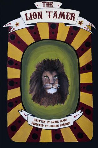

The poster for The Lion Tamer, covered the first play of the night. The story was about how money and fear ruled a twisted circus with a deadly lion. It first had two different designs, conceived by junior Isabelle Davis. She combined elements of both to create the final poster.The poster for The Lion Tamer, covered the first play of the night. The story was about how money and fear ruled a twisted circus with a deadly lion. It first had two different designs, conceived by junior Isabelle Davis. She combined elements of both to create the final poster.
It was one of four, 20 minute plays in FEST 2017. FEST is a theatre program that uses student created and student directed plays.
Co-producer Jacqui Sheehan sells the posters for $25 each to support the FEST scholarship.
A different artist designed a poster for each of the plays.
CWC members turned poster artists gathered to discuss design ideas. Then, they decided the best ideas among themselves. They converted the words and thoughts of their particular play into one simple, eye-popping poster.
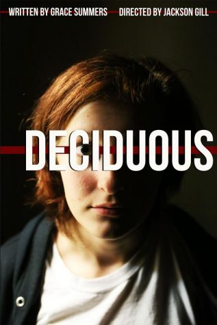
After analyzing Deciduous, junior Maggie Sears created a poster with an angular, concise design in black-and-white — inspired by the gothic novella, The Strange Case of Dr. Jekyll and Mr. Hyde.
Deciduous, which means to fall off, referring to leaves on trees, is about a woman struggling with depression and becoming isolated from society.
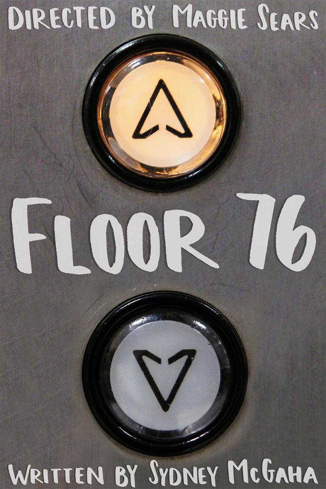
Senior Moid Ali photographed elevator buttons at JCPenney for the Floor 76 poster, “stitching them” together using Photoshop. Floor 76 recounted a story of five people meeting for the first time in an elevator during 9/11. The serious nature of this play and the trapped in an elevator setting influenced Ali’s process. Ali also designed the FEST T-shirt. The shirt featured five simple symbols to represent each play.
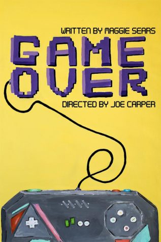
Junior Dayanna Moreno, the newest poster designer, created the artwork for Game Over. She described her poster as “the most cheerful of them all. “My artwork is full of bright colors,” said Moreno. That’s because the play was about an enjoyable take on the trapped-inside-a-video-game story with a sinister twist. Her original design used the words ‘game over’ inside a TV screen. The poster’s final design features a yellow background, contrasted with its purple letters, and a video game controller. Moreno topped off the hand drawn poster with a layer of paint.
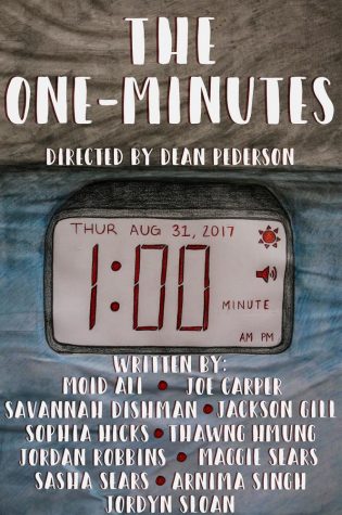
Junior Allie Wooton designed the poster for the ten one-minute plays. Wooton said her design incorporated the date of opening night in a timer. She made sure to leave room below for playwright’s names.
